
Photo by Pesce Huang on Unsplash
You receive a newsletter, open it, and... immediately close it. Text too cramped, aggressive colors, buttons nowhere to be found on mobile. 3 seconds wasted, one less reader.
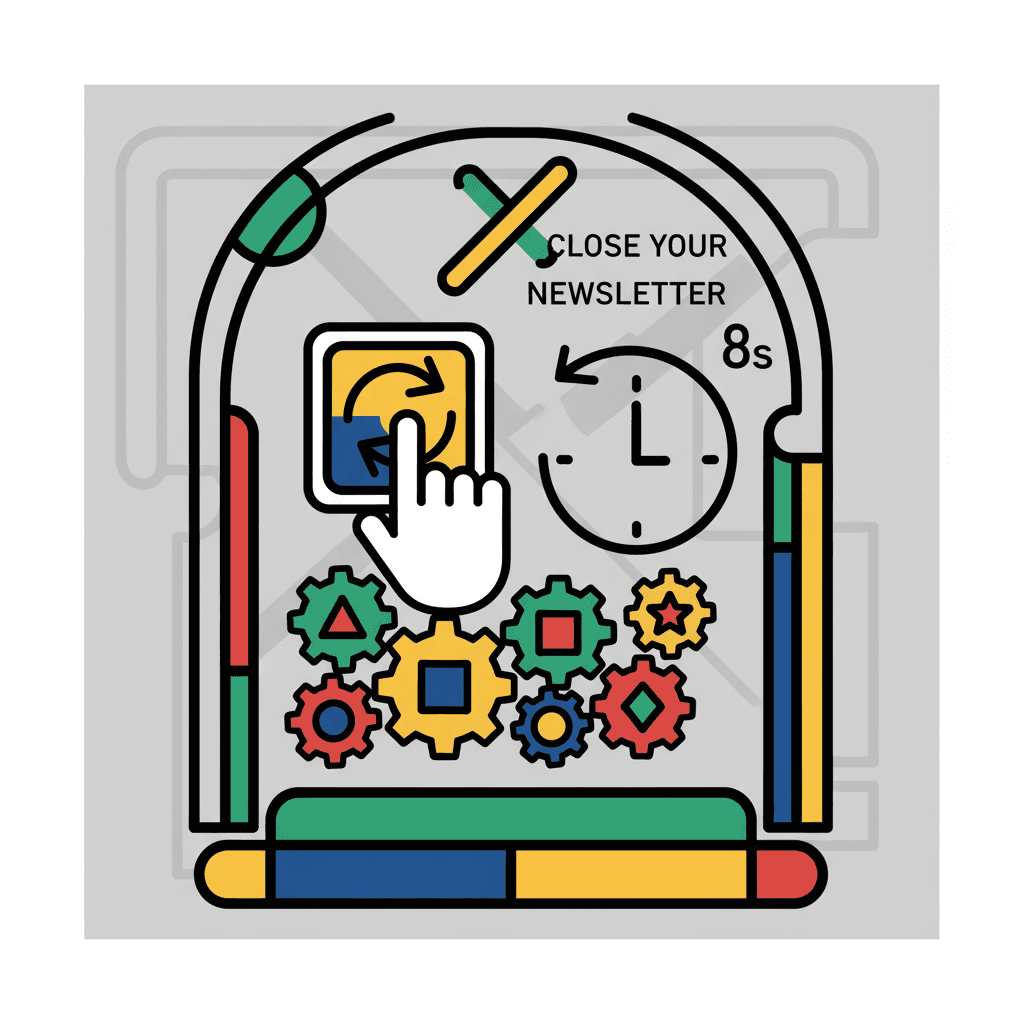
TL;DR: 77% of readers abandon a poorly designed newsletter in under 8 seconds. Here are the 7 design rules that turn your emails into click magnets, even if you generate your content automatically.
Why Your Newsletter Design Impacts Your Results#

Photo by Kelly Sikkema on Unsplash
Content isn't everything. A newsletter with excellent content but failed design will lose 40% of its readers before they even read the first line.
The numbers speak for themselves:
- 8 seconds: average time before a reader decides to continue or close
- 70% of newsletters are read on mobile — your design must adapt
- +35% click-through rate with optimized design vs "plain text" newsletter
- 3 colors max: beyond that, the brain switches off
Design isn't decoration. It's a conversion lever on par with your email subject line or content. A well-designed newsletter guides the eye, facilitates reading, and naturally drives action.
The classic mistake: believing that a "simple" newsletter = newsletter without design. Wrong. Simple means clean, not sloppy. Apple masters simplicity. A copy-pasted Word email, no.
Rule 1: Visual Hierarchy That Guides the Eye#

Photo by Mika Baumeister on Unsplash
Your reader scans first, reads later. Their eye follows a predictable path: headline → subheadings → images → buttons → text. Respect this logic.
The structure that works:
- Main H1: 24-28px, contrasting color, maximum 8 words
- H2 sections: 20-22px, 20px spacing before/after
- Body text: 16-18px (never less than 14px on mobile)
- Secondary text: 14px for mentions, footer, dates
Concrete test: look at your last newsletter for 3 seconds. What do you retain? If it's blurry, your hierarchy failed. The reader must grasp the main idea at a glance.
Hierarchy errors that kill engagement#
| ❌ Error | ✅ Fix |
|---|---|
| Everything same size | Headlines 24px, text 16px |
| Headlines buried in text | 20px minimum spacing |
| 5 heading levels | 3 maximum (H1, H2, H3) |
| Identical colors everywhere | Accent color for headlines |
Pro tip: use the "squint test" rule. Squint while looking at your newsletter. Important elements (headlines, buttons) should stand out even when blurry.
Rule 2: Optimal Text/Image Ratio for Engagement#

Photo by Šimom Caban on Unsplash
Too much text = boring. Too many images = spam. The magic ratio: 70% text, 30% visual elements.
Why this ratio?
- Anti-spam filters penalize overly visual emails
- The brain processes images 60,000 times faster than text
- A 100% text email converts 23% less than a balanced email
Types of images that work:
- Screenshots: capture of your tool, your results
- Simple graphics: a stat, before/after, progression
- Profile photo: humanizes, creates connection (especially in header)
- Vector illustrations: clean, adapt to all sizes
Absolutely avoid:
- Pixelated images (minimum 300 DPI resolution)
- Too "corporate" stock photos (smiling man in suit)
- GIF animations (heavy, distract from essentials)
- Text embedded in image (unreadable on mobile)
Image format guide by usage#
| Usage | Recommended format | Optimal size |
|---|---|---|
| Header/banner | JPG or PNG | 600x200px |
| Article illustration | Transparent PNG | 400x300px |
| Profile photo | Round JPG | 80x80px |
| Chart/stat | PNG | 500x400px |
Technical tip: compress your images with TinyPNG. An email that loads in 2 seconds vs 8 seconds means 40% more readers who stay.
Rule 3: Readable Fonts and Sizes on Mobile#

Photo by Philip Oroni on Unsplash
70% of your readers will read on smartphone. An unreadable font = a deleted newsletter.
Fonts that work on all platforms:
- Sans-serif: Arial, Helvetica, Open Sans, Roboto (perfect readability)
- Serif: Georgia, Times (for premium touch, but only in headlines)
Minimum sizes:
- Mobile: 16px minimum (14px = too small, forced zoom)
- Desktop: 18px comfortable for body text
- Headlines: 24px minimum, 32px maximum
The subway test: your newsletter must be readable on a moving subway, on an iPhone 13, without zoom. If you squint to read, it's failed.
Tested and approved font combinations#
| Headline | Body text | Style |
|---|---|---|
| Open Sans Bold | Open Sans Regular | Modern, tech |
| Georgia Bold | Arial Regular | Elegant, premium |
| Roboto Bold | Roboto Regular | Clean, minimalist |
| Helvetica Bold | Helvetica Regular | Classic, reliable |
Golden rule: one font for headlines, one for body text. Never three different fonts in the same newsletter.
Rule 4: Visible and Clickable CTA Buttons#

Photo by Ferran Feixas on Unsplash
Your call-to-action (CTA) button generates your conversions. If it goes unnoticed, your click rate drops by 60%.
Anatomy of a good CTA button:
- Contrasting color: red/orange on white background, green on dark background
- Minimum size: 44x44px (comfortable finger-tap zone)
- Actionable text: "Download the guide" vs "Click here"
- Spacing: 20px margin all around
- Shape: rounded corners (8px), more engaging than square
Optimal placement:
- Above the fold: visible without scrolling
- After each section: if your email has 3 paragraphs = 3 CTAs
- End of email: the main CTA, bigger, more visible
CTA colors that convert best#
| Color | Psychology | Ideal sector |
|---|---|---|
| Orange | Urgency, action | Creators, training |
| Green | Trust, validation | Finance, health |
| Red | Emotion, impulse | Promo, urgency |
| Blue | Professional, security | B2B, tech |
Simple A/B test: send the same newsletter with a green button and an orange button to two segments of your list. The winner becomes your standard.
Common mistake: multiplying CTAs. One email = one objective = one main CTA. Otherwise, your reader hesitates and clicks nowhere.
Rule 5: Mobile-First Design for 70% of Reads#

Photo by Jorge Franganillo on Unsplash
Your newsletter MUST be designed mobile-first. Desktop is a bonus.
Mobile-first principle:
- Single column: forget complex 2-3 column layouts
- Maximum width 600px: adapts to all screens
- Full-width buttons: easy to touch with thumb
- Centered or left-aligned text: never justified (irregular spacing)
Mandatory mobile checklist:
- Headline readable without zoom
- Finger-clickable buttons (44px minimum)
- Images that adapt to screen width
- No horizontal scrolling
- Load time < 3 seconds
Mobile vs desktop differences#
| Element | Mobile | Desktop |
|---|---|---|
| Content width | 320-414px | 600px max |
| Font size | 16px min | 18px comfort |
| Spacing | 15px | 20px |
| CTA button | Full width | 200px max |
Practical test: send yourself the newsletter and open it on your smartphone. If you need to zoom or scroll horizontally, start over.
Pro tip: use your email editor's mobile preview tool. But nothing replaces testing on real devices.
Rule 6: Minimalism vs Cluttered Newsletter#
Less = more. A clean newsletter reads better, converts better, and is remembered better.
White space principle:
- 40% of your newsletter should be "empty" space
- Spacing between sections: 30px minimum
- Side margins: 20px on mobile, 40px on desktop
- One idea per paragraph, one paragraph per mobile screen
White space isn't waste. It's what allows the brain to breathe, prioritize, remember.
Elements to eliminate:
- Multiple borders and flourishes
- More than 3 different colors
- Fancy or decorative fonts
- Animations or blinking elements
- Complex or textured backgrounds
Minimalist vs cluttered newsletter comparison#
| Characteristic | ❌ Cluttered | ✅ Minimalist |
|---|---|---|
| Reading time | 45 seconds | 20 seconds |
| Completion rate | 30% | 70% |
| Memorization | 15% | 45% |
| Click rate | 2% | 8% |
The 5-second test: show your newsletter to someone for 5 seconds. If they can't summarize the main message, it's too cluttered.
Rule 7: Consistency with Your Brand#
Your readers must recognize your newsletters at first glance, even without seeing the sender.
Consistency elements:
- Colors: 2-3 colors maximum, always the same ones
- Logo/photo: same placement, same size
- Tone: formal or casual, but constant
- Structure: same type of introduction, same CTA format
Personal template to create:
- Header: logo + name + tagline (30 words max)
- Intro: same style hook (question, stat, anecdote)
- Body: 2-3 sections maximum
- CTA: same format, same color, same placement
- Footer: social links + unsubscribe
Basic visual consistency kit#
| Element | Specification | Example |
|---|---|---|
| Primary color | Exact HEX code | #FF6B35 (orange) |
| Secondary color | Exact HEX code | #2E86AB (blue) |
| Headline font | Exact name | Roboto Bold |
| Body font | Exact name | Roboto Regular |
| Logo | Fixed position | Top left corner |
Beginner mistake: changing design every newsletter "to avoid boring readers". Wrong. Consistency creates recognition, recognition creates trust.
Pro tip: create a "brand guidelines" document with your colors, fonts, and rules. Even if you're alone, it prevents drift.
How Yeemel Automatically Applies These Design Rules#
When you generate a newsletter with AI from your videos, Yeemel automatically integrates these design principles. No need to be a graphic designer.
Smart automatic design:
- Automatic hierarchy: your section titles become well-spaced H2s
- Optimal text/image ratio: AI doses content to respect the 70/30 ratio
- Mobile-first: all templates are responsive by default
- Well-placed CTAs: your products are integrated with optimized buttons
Personalizing your style:
- 6 tones available: direct, educational, inspiring, storytelling, structured, provocative
- Consistent template: same structure, same colors, same placement for all your newsletters
- Free editor: you can adjust design in the rich text editor without constraints
The advantage: you focus on your content, Yeemel ensures it looks beautiful and readable.
Configure once, perfect design for life: you define your colors and style, every generated newsletter automatically respects your brand rules.
Try Yeemel for free and generate your first professionally designed newsletter in 2 minutes.
Templates and Concrete Examples of Well-Designed Newsletters#
Template 1: Educational newsletter (YouTube creator)
[LOGO] + First name + "My weekly newsletter"

Hey [First name], 👋

🎯 This week: [Catchy title]

[2-3 lines of personal intro]

## Key point #1
[Paragraph + concrete example]

## Key point #2
[Paragraph + action to take]

## Key point #3
[Paragraph + resource]

💡 Key takeaway: [One sentence takeaway]

[CTA BUTTON: "Access the training"]

See you next week!
[Signature]
Template 2: Product/service newsletter (coach)
[PROFILE PHOTO] + "Tip of the week"

[Hook question]

I received this question yesterday: "[Client question]"

Here's my answer in 3 points:

✅ [Tip 1 + mini-example]
✅ [Tip 2 + mini-example]
✅ [Tip 3 + mini-example]

[CTA: "Book your free audit"]

PS: [Anecdote or bonus]
Template 3: Storytelling newsletter (trainer)
[MINIMAL HEADER: name + tagline]

3 years ago, I was exactly like you...

[Personal story - 2 paragraphs]

What changed everything:
→ [Lesson 1]
→ [Lesson 2]
→ [Lesson 3]

Want the same transformation?

[BIG BUTTON: "I'm starting now"]

[Simple footer]
Final design checklist#
Before sending, check:
- Readable in 30 seconds maximum
- One main visible CTA
- Colors consistent with your brand
- Perfect on mobile (real test)
- White space = 40% of newsletter
- 16px minimum font
- Compressed images (< 100KB each)
- CTA button > 44px height
FAQ#
How many colors maximum in a newsletter?#
Maximum 3 colors: one primary (your brand color), one secondary (contrasts and CTA), and one neutral (text, backgrounds). Beyond that, it becomes messy and amateur.
What's the optimal width for a newsletter?#
600px maximum. This is the width that displays perfectly on all email clients (Gmail, Outlook, Apple Mail) and automatically adapts to mobile.
Should I use images in every newsletter?#
No, but at least one visual element: logo, profile photo, or simple illustration. The ideal ratio remains 70% text, 30% visual. A 100% text newsletter looks bland.
How do I test mobile design without sending the newsletter?#
Use your editor's mobile preview, but most importantly send yourself a test on your smartphone. Previews never replace testing on real devices. Check on both iPhone and Android.
Do my Yeemel newsletters automatically respect these rules?#
Yes, all Yeemel templates integrate these principles: visual hierarchy, mobile responsive, optimized CTAs, correct spacing. You can customize colors and style, but the foundation remains solid by default.
Conclusion: Your Next Email Will Be Beautiful#
Newsletter design isn't art for art's sake. It's science: each rule above concretely improves your open rates, read rates, and click rates.
Start with one rule at a time. This week: check that your CTAs are visible and clickable on mobile. Next week: optimize your visual hierarchy. In a month, your newsletters will look professional.
Already generating your newsletters automatically? Transform your videos into perfectly designed emails and apply these rules without technical effort.
Good design means your message gets through. Excellent design means your reader takes action.
Related articles
5 Pillars to Monetize Your Audience (€2,000 vs €300)
You have 20,000 YouTube subscribers and earn €300 per month from ads. Meanwhile, a creator with 2,000 email subscribers generates €2,000 monthly. The difference? They master the 5 pillars of monetization.
ReadEmail Affiliate Marketing: €1500/month with 2000 Subscribers
You're sending newsletters to 2000 subscribers but only earning €47 per month? The problem isn't your list — it's your monetization strategy. While you're publishing free content, other creators
ReadAffiliate Marketing: 500 Subscribers is Enough to Start Earning
You've been publishing content for months, you have an audience that trusts you, but your revenue is stuck at €200 per month. You see other creators talking about 4-figure affiliate
Read